Case study 1
Increased product revenue by 6.29% by improving UX and redesigning UI
Project Summary
Boombrush is an oral care company with a subscription-based business model. We have two product groups: BoomBrush Kit Single Pack and Duo Pack and we want to sell more Duo Pack. I helped increase the product revenue of Duo Pack by 6.29% in 6 weeks by improving the user experience and redesigning the user interface by designing a new store with a new product buying sequence. The team and I did this by applying UX research, mobile first design, improving hierarchy and navigation and making the interactive elements in the UI more obvious, logical and easy to control for mobile users.

Outcome statement
We have two different product groups: “Boombrush Kit Single Pack” and “Boombrush Kit Duo Pack”. We want to sell more Duo Pack, but with the original design of the store the Duo Pack will be less visible for desktop and mobile users, because they need to scroll down first to see this product. Based on the heatmaps data we can see that more than 25% will leave the store before scrolling down and this percentage is even higher on mobile. More than 85% of the traffic comes from mobile, so it’s our first priority to work with mobile-first design in mind.
Outcome statement
The team and I helped increase the product revenue of Duo Pack by 6.29% in 6 weeks by improving the user experience and redesigning the user interface by designing a new store with a new product buying sequence with mobile first design in mind.
Users and needs
More than 85% of the traffic comes from mobile. Boombrush target customers are Millennials, folks for whom the smartphone is a permanent fixture of nearly every activity they undertake. 69% of them will buy something online each month. They consider shopping online to be easy and quick, and research showed that they would abandoning the website first of all the generations when the customer journey is full of annoyances.

My role and the work I did
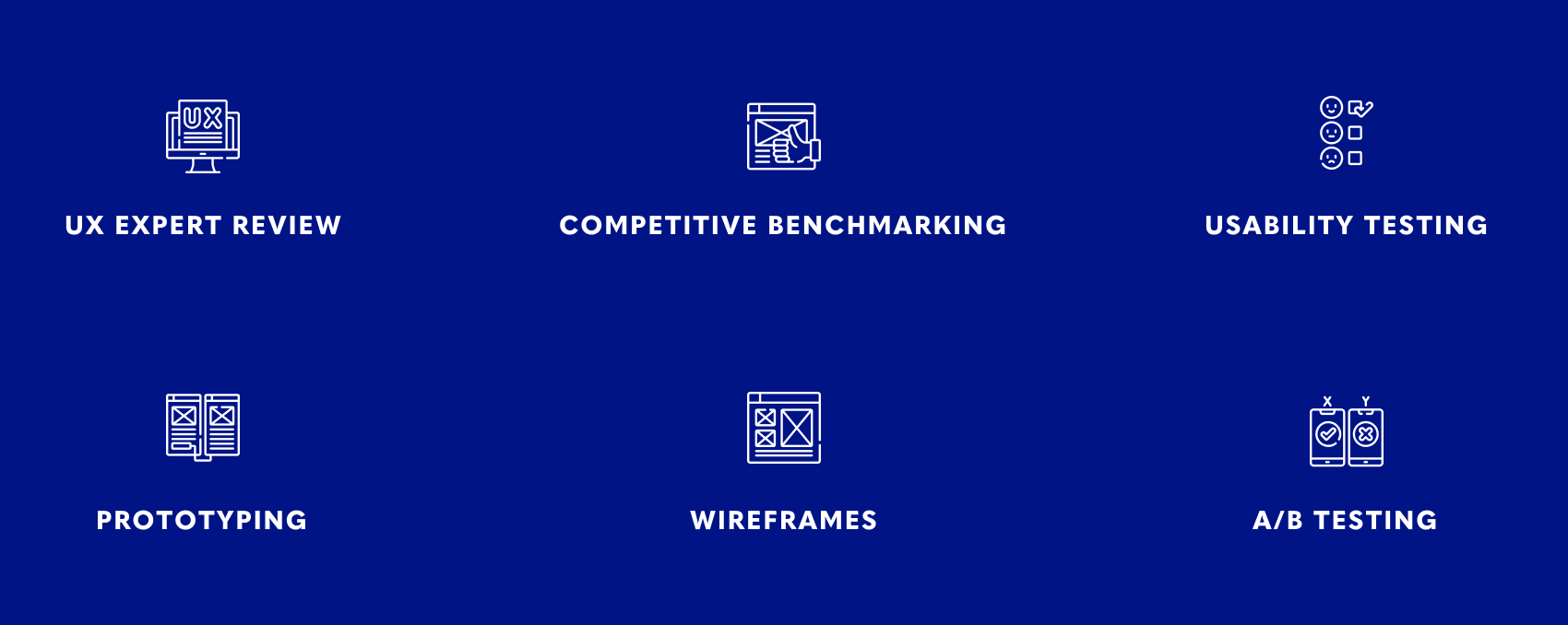
As UX Designer, I collaborated with a Full Stack Developer and Visual Designer to iterate on and test possible improvements to increase the conversion rate. We have weekly calls with the whole team included the CEO also our product owner and CTO to present my findings and design decisions. My work was research based, hypothesis-driven and validating though testing. I applied UX research methods to find out: who, what and why, from making sketches till high-fidelity prototypes, organizing usability testing sessions and preparing and analyzing A/B testing results.
Constraints, process and activities
Constraints
• Limited timeline: 6 weeks.
• Limited visual content: new product photo’s not ready yet.
Process steps

UX expert review
Why conduct a UX expert review?
- A fast and cost-effective manner to improve radically.
- Get a fresh look at the website from another perspective.
- Spot any UX and usability issues before spending money on new web development.
- This review will serve as a roadmap for the next steps on improving the website.
The process
For this review I followed these 5 guidelines:
1. What are the usability strengths?
2. What are the usability problems?
3. Severity ratings (1-5) for each usability problem to give it a priority
4. Recommendations
5. Examples of best practices
What did I learn with UX expert review?
The original design has a good foundation of simplicity to build on. It’s in the details that we still have space to improve to exceed the expectations of the user. There are 4 main problems:
- We need to work on a flow for users which bought the toothbrush from a third party website. Because they can’t start a subscription by themselves on the website. Which means they need to contact the customer service to solve this problem.
- The store page isn’t showing the 2 product groups equally at the same time.
- Account dashboard needs a consistent design.
- We need more content to strengthen the company’s vision and identity.
Competitive benchmarking
Why conduct a competitive benchmarking?
- A competitive benchmarking provides strategic insights into the features, functions, flows, and feelings evoked by the design solutions of your competitors. By understanding these facets of competitors’ products, you can strategically design your solution with the goal of creating a superior experience.
The process
1. Selecting the competitors:
When selecting the competitors to benchmark against. We choose to look at 3 scale-up companies with a subscription based business model. One of the companies is a direct competitor and two are indirect competitors. They are once in the same startup position but grew immersive in a short timeline. In that case, benchmarking against them can offer some insight into how you can achieve their success.
2. Look for commonalities among competitors:
- The tone and copy of the competitor
- Good and bad features
- User reviews
- Wait/load times
- Customer service
- Design
What did I learn with competitive benchmarking?
Based on the findings the competitors have one thing important in common and that is the art of simplicity. They won’t show everything at the same moment to the user to avoid information overload. Which means they have more steps to the checkout process. But they have a good reason for that, to give the customer the confidence in buying their product by answering the most asked questions at each step. This approach works seamless on mobile screens.
Usability testing
Why conduct a usability testing?
The goals of usability testing vary per case study. But for now we want to focus on:
- Identifying problems in the design.
- Uncovering opportunities to improve.
Which method did I chose for the testing?
- Moderated: produces in-depth results thanks to the direct interaction between researchers and test participants.
- Remote: due to covid measures.
- Assessment research: to evaluate the product’s general functionality.
The process
I prepared a usability testing script with an introduction, some warm-up questions, tasks and wrap-up questions and a closing word. I chose to do the remote session via Zoom and ask the user to share her screen.
What did I test?
We want to know how the user will interact with the new store page design. I was testing a very specific part (selecting product options) to validate the design decisions.
What did I learn with usability testing?
People will actually read the descriptions when the sentences are not too long. Their attention will go to the buttons first. When they have questions like about the toothbrush or refill plan they expect this will be shown on the next screen. Most important they understand how to select their options.
A/B testing
Why conduct A/B testing?
- How do we know if the new variation of the store works better than the original one? Validate it with real users! That’s why we decided to do an A/B testing. Together with the Full Stack Web Developer we set up an A/B test in Google Optimize after the launch of the new store.
What do we need to measure?
We want to know in which variation we have more conversion in Duo Pack.
What did I test?
The store page. 50% of the traffic will see store variation A and the other 50% will see store variation B.
How do we decide a winner?
We need 4 factors to get reliable data out of this A/B testing:
- Sufficient data
- Consistent data
- Differentiated data
- Statistical confidence
Sufficient data:
We need a representative sample size for the website. Based on the conversion size for the company, we took 100 conversions per variation as our minimum to call a winner.
Consistent data:
Minimum of two weeks to gather enough data for this A/B testing. We decided to extend the A/B test for three days, because the conversions of the original variation didn’t reach 100 conversions yet and one of the variations needs to win for at least five days straight.
Differentiated data:
We need to look for difference in the data. For that we need to have a higher lift percentage than the natural website variance. To decide the natural variance we can do an A/A testing. But in our situation this will be very time-consuming, because it requires a large sample size and for a startup company this method will not be our first choice. Instead of A/A testing we opt for alternatives such as triangulating data (heatmaps, scrollmaps and visitor recordings) over an A/A test. This means we will have two sets of performance data to cross-check with each other.
Statistical confidence:
Looking at the variation B statistical confidence of 90% combined with all the data mentioned above. We can say that variation B performs better than the original.
Result:
We did A/B Testing for 17 days to reach a minimum conversion of 100 for each variation and variation B wins for five days straight. Cross checking with the qualitative data from heatmaps, scrollmaps and visitor recordings we can say that we sell more Duo Pack in variation B. Our goal was to sell more Duo Pack and we successfully increase by 6.29% in product revenue in variation B.
What did I learn with A/B testing?
Next time I will chose to test small changes instead of a version with big changes. This will let us gather more precise data and know exactly what design changes works well. We need more time in the next A/B testing to get enough data to call a winner, because for startup companies often the amount of traffic will be a problem.
The winning store

 Go back