Case study 3
People are feeling more in control after adjusting three main user flows
Project Summary
Because of the widespread lockdowns and quarantines, global viewership in general started to increase. The human needs has changed during a pandemic and also the viewership trends.
People are moving from their smartphones back to their computerscreens, because of stay-at-home order. That’s why I choose to improve YouTube’s desktop version.
From survey’s and in-depth interviews I can say that people feel the algorithm is in charge of what they will see on the platform, they feel out of control. Based on this problem I came up with improving the 3 main user flows:
- People browsing randomly
- People searching for specific type of video’s
- People coming back to watch the subscribed channels
UI improvements
Random browsing:
- A search tag bar (This idea was before YouTube implemented it on their website).
- New categorising design in rent and buy section of movies and shows.
Searching videos:
- Making the most important filter more visible.
Subscribers:
- Filter function to organise all the videos from subscribed channels.
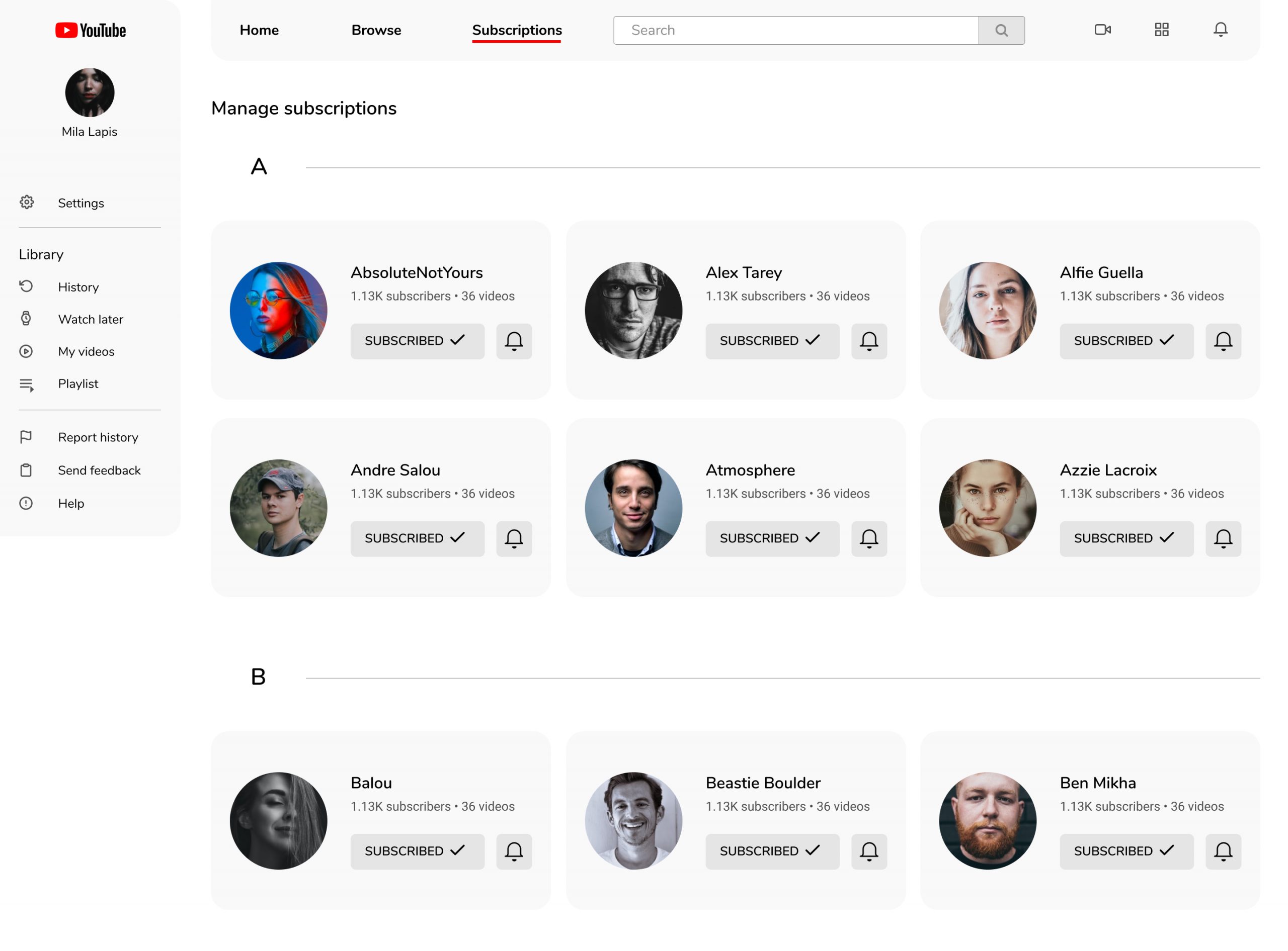
- A filter to manage the subscribed channels.

Problem statement
I came up with the idea to adjust the functions from the website to adapt to the changed human needs during the pandemic by simplifying the user interface by improving the existing homepage with 3 main user flows for the general viewer:
- People browsing randomly
- People searching for specific type of video’s
- People coming back to watch the subscribed channels
Problem statement
People are feeling out of control when using YouTube, because the algorithm provides them with unlimited videos based on earlier search results and they can’t change their own video preference.
Users and needs
YouTube has 2 billion users worldwide. The only social network that has more monthly active users than YouTube is Facebook. 79% of internet users say they have a YouTube account. Everyday people watch one billion hours of videos on this platform. YouTube, the most popular video platform in the world, has only become more popular during the coronavirus pandemic.
Human needs has changed during the pandemic and this has been revealed by YouTube’s newest data. Basically there are 3 pillar of needs: self care, social connection and identity.
The anxiety and uncertainty triggered by the global pandemic drove people in search of tools to cope: namely videos related to food, exercise, relaxation and even sleep.
As social distancing and quarantine restricted people’s ability to connect, technology was there to help bridge the gap somewhat. YouTube viewers used video to engage with each other directly and indirectly, sometimes in nuanced ways: even just participating in a rising coffee-making trend can make someone feel more connected to other people.
People sought to reaffirm and redefine themselves as the pandemic disrupted plans, jobs, and the myriad things that play a role in self-perception. Video proved to be a unique way people could both express who they were and who they might become. For example by learning a new skill.
During some in-depth interviews with people, I repeatedly heard complains about the way that YouTube don’t really let the user choose what to watch, they get the feeling that the algorithm is in charge. People are more aware of this now, because they are spending even more time now on this platform.
My role and the work I did
I started this project out of curiosity. I asked a developer to participate in some discussions and affinity diagramming, because it’s about collaboratively sorting UX findings and design ideas. I did all the discussions, in-depth interviews and usability testing sessions remotely during the lockdown.
Constraints, process and activities
Constraints
Due to limited resources I can’t find more people doing surveys, usability testings or in-depth interviews. The rest of the data I need to rely on online sources. Sometimes it’s hard to find exactly the data that you’re looking for.
Week 1
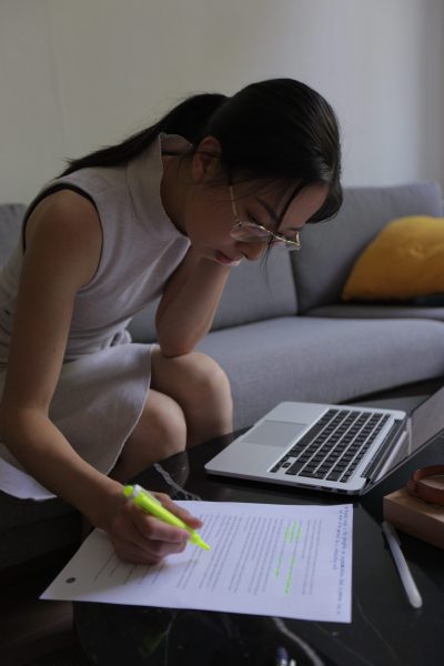
I spend the first few days in doing research about video sharing platforms, YouTube itself and finding information about the impact on human needs in coronavirus pandemic. I created a survey to get more insight about the users and their needs. It took a while before I got all the answers. The survey contains a mix of quantitative and qualitative data.
Week 2
This week I organized two remote in-depth interviews, so I prepared a script with questions. It was important to ask a lots of open questions to get to know: how, what and why. And at the end of the week I started to analyse all the answers.
Week 3
It’s important to know more about the user’s point of view, needs and pain points. So I decided to do user journey mapping. The result was good until the users started to check their recommended videos section. The pain point is: They’re feeling out of control and can’t do anything to change the type of videos the algorithm provided them. For instance if they searched for a yoga video once, they will get recommended more yoga videos on this section.
Week 4
Based on the earlier UX research results I decided to do a competitive benchmarking. YouTube might be the biggest and most popular video sharing platform but it’s always good to look at the competitors. I choose Dailymotion, Vimeo and Netflix.
Dailymotion
This is the second largest video-sharing platform after YouTube, so it’s important to include this competitor.
Vimeo
They refers to its users as “creators.” It’s a community of indie filmmakers, documentarians, and videographers. Where the YouTube homepage shows you what’s popular, Vimeo promotes only “Staff Picks”, content curated for its high production value.
Netflix
They are not a video-sharing platform, but a subscription based streaming service. But they have one thing in common: providing video content for users. However YouTube also has a section with movies and shows rent/buy service, but this section looks exactly the same as other sections. It’s good to look at Netflix’s user interface design, how they get people hooked on their tv screen and transferring the theater feeling to everyone’s home.
Week 5
After all the data I collected from different UX research methods, I have both qualitative and quantitative data. Based on the outcomes I decided to make some drafts based on the 3 most important user flows. After each draft I will do a small usability testing session to validate my design. I had a few iteration for each flow to get it right.
Week 6
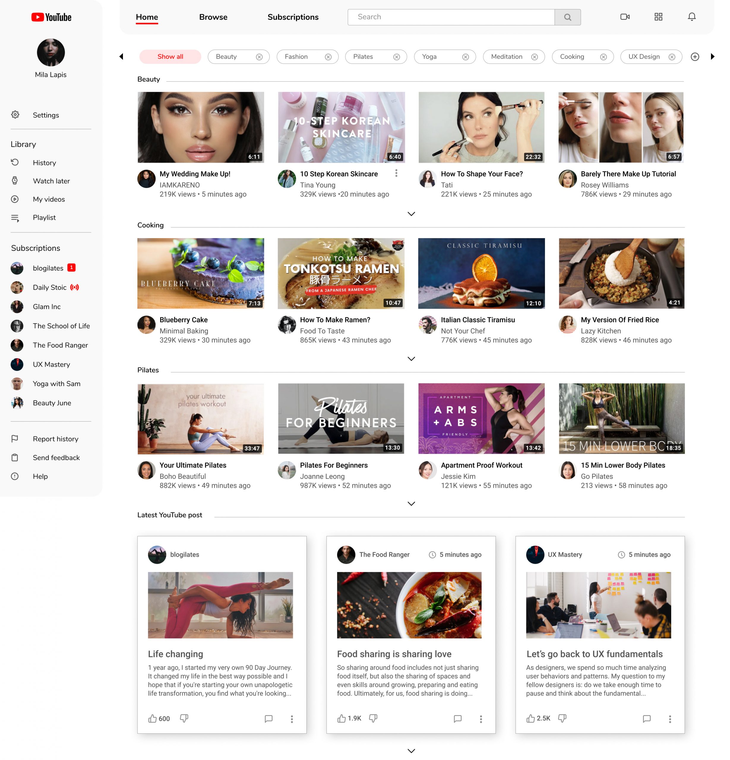
I created a new dashboard for the user. This dashboard will be the first screen the user will see on this platform after log in. In this design I accentuated the 3 most important user flows: browsing, searching and subscribers.
Week 7
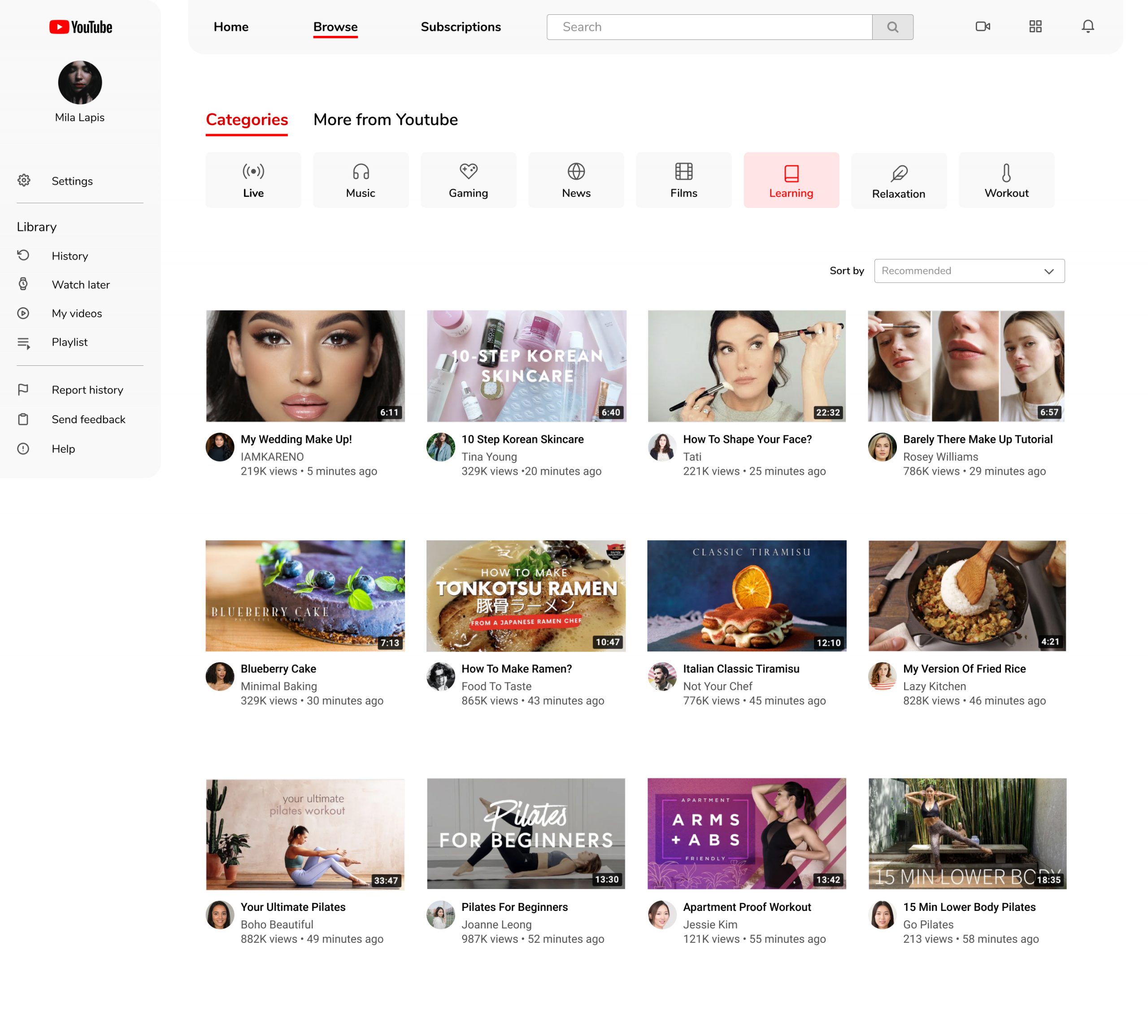
This week I spend most of the time in creating in high-fidelity wireframes for the browsing flow. I divided this flow into 2 sections:
- Categorising the videos on browsing list
- Better filtering option for movies and shows section
- SEE PROTOTYPE BROWSING
Week 8
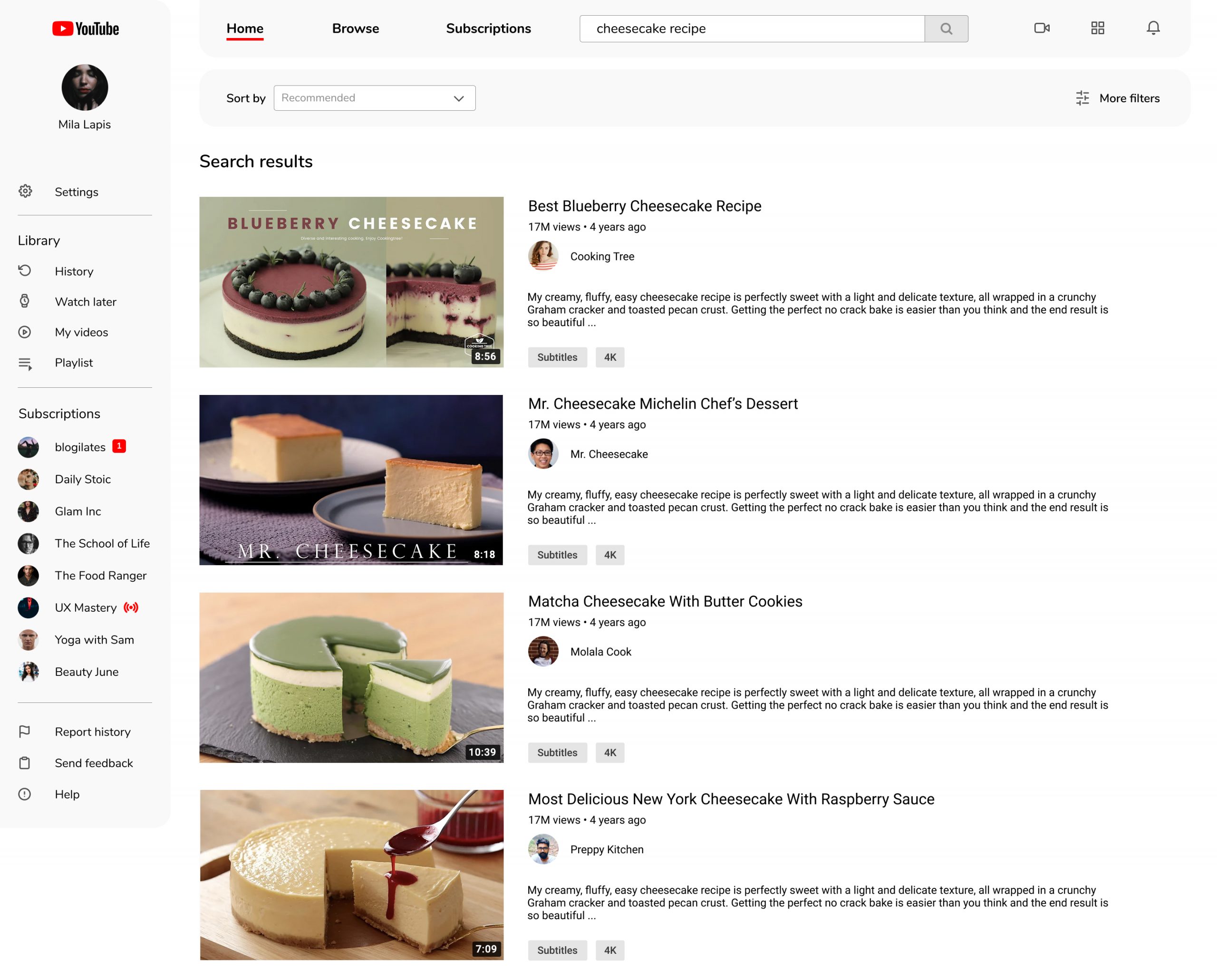
This week I spend most of the time in creating in high-fidelity wireframes for the searching flow.
- Better filter option for displaying search results
- SEE PROTOTYPE SEARCHING
Week 9
This week I spend most of the time in creating in high-fidelity wireframes for the subscription flow. Divided into 2 sections:
- Showing all the subscription videos
- Manage all the subscribed channels
- SEE SUBSCRIPTION FLOW
Week 10
It’s time to do a usability testing session to validate my assumptions again and see how the user interact with the new design.
 Go back